Asteer
The Challenge
Aster needed a cohesive visual identity that could:
-
Reflect its high-quality, patient-centered care
-
Work across diverse touchpoints (print, signage, digital, stationery)
-
Strengthen brand recognition across its expanding healthcare network
Their existing materials lacked consistency and didn’t convey the sophistication of the organization.
The Solutions
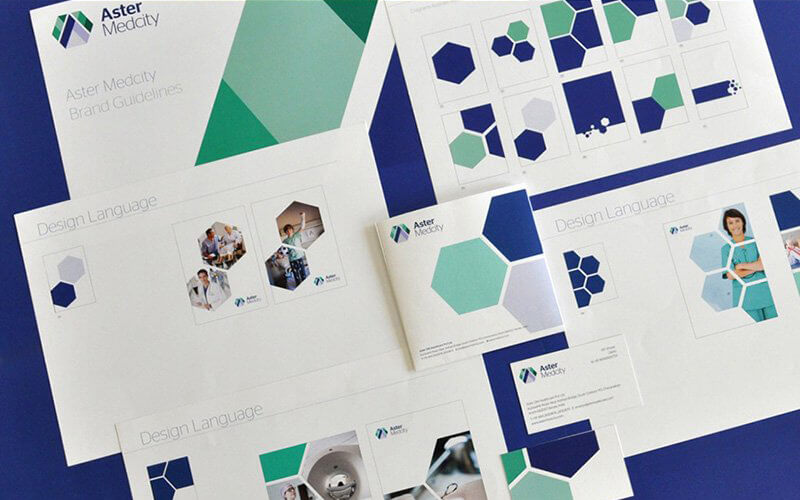
A new design language was developed around:
-
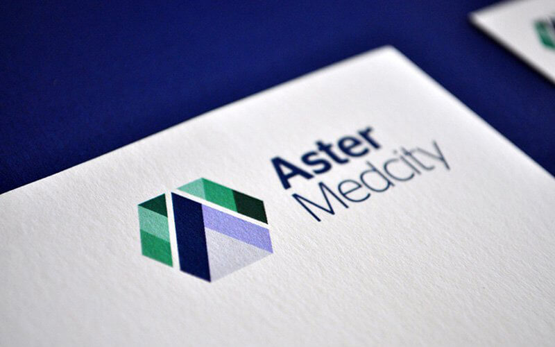
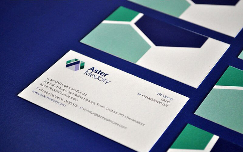
A geometric, multi-faceted symbol representing collaboration, care, and advanced medical expertise
-
A clean, modern color palette of teal, green, and navy, suggesting trust, wellness, and stability
-
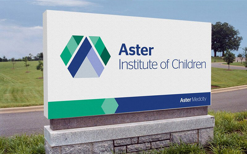
Consistent layout patterns using hexagonal and angular shapes for strong visual continuity
-
Refined typography for a professional, contemporary look
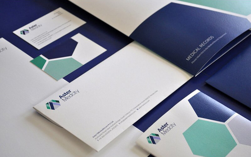
The system was applied across:
-
Business cards, envelopes, letterheads
-
Brand guidelines and internal communication materials
-
Patient-facing brochures and record folders
-
Digital assets and CD/DVD templates
-
Outdoor signage, including the Aster Institute of Children
The Results
-
A unified identity that strengthened Aster’s brand presence
-
Improved readability and visual clarity across all touchpoints
-
A flexible design system that scales across departments and specialties
-
Enhanced trust and recognition with patients and partners
Got a project?
We bring bold ideas to life—shaping powerful brand identities and intuitive experiences that help businesses stand out, connect, and make an impact.

Quick Links
Home
About us
Services
Contact
Resources
Services
Website design
Brand design
Printing service
Marketing